Redesigning the integrations screen
Aimylogic is a visual chatbot builder by Just AI, including voice bots that take inbound and make outbound calls. Its users need a bot but have little or no coding experience — which is why they reach for a visual builder instead of writing one from scratch.
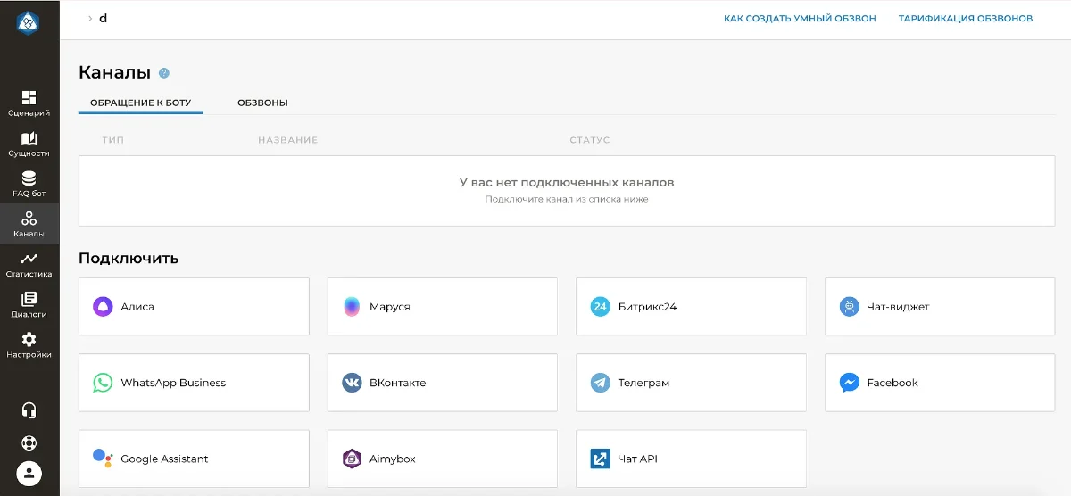
Problem. People were telling support that the screen made channels hard to find. The list already held 11 channels, and that was the volume at which users started saying they couldn’t locate the one they needed. More integrations were on the roadmap — without a redesign the complaints would only multiply.
Goal. Cut support requests coming out of the find-a-channel scenario.
A scalable channels screen will make new integrations easy to add and keep support requests down for years
Success metrics
- No recurring user complaints about finding channels
- Scalability proven in practice: every new integration ships without reworking the screen or the card
Product team
One designer (me), frontend developers, QA. I owned the interface design, the developer handoff guide and the final design-to-build review. The screen had to hold up from 1200 to 1920 px.
User scenario
Analytics showed that people who built chatbots rarely built voice bots, and the other way round. Voice bots also sat on their own pricing line. I proposed changing the scenario and segmenting the two right on the dashboard.
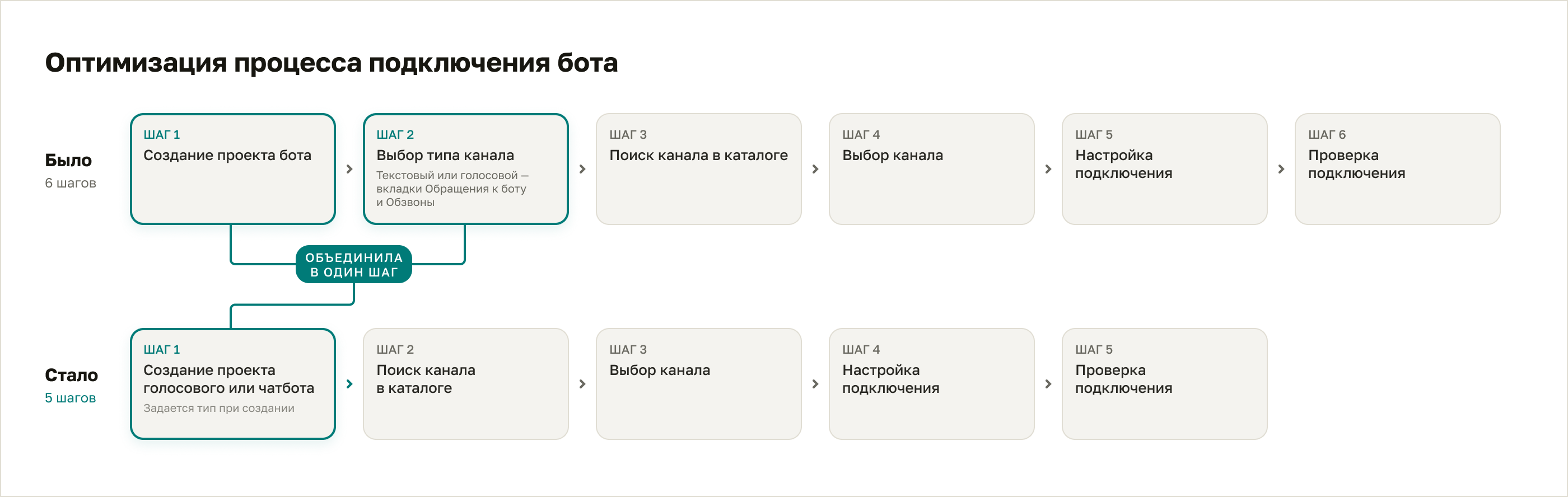
Designing the screen
The interface met people with a passive empty state — “You have no connected channels” — and a neutral “Connect” button. That reports the system status but prompts nothing, and it costs activation. I used the browser inspector to hide the empty-state block temporarily and judge the layout without it. The page read cleaner, but the key connect scenario needed a stronger accent.
What I did:
- Dropped the passive status headline.
- Rewrote the button from a neutral infinitive to a direct imperative addressed to the user — a difference Russian marks with the verb form — so the label asks for the action instead of naming it.
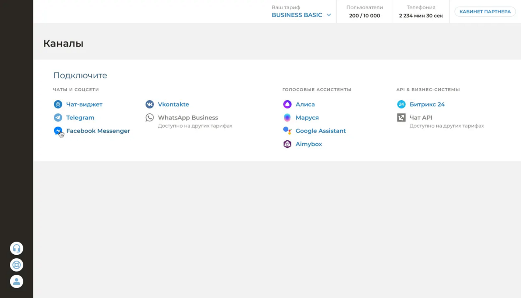
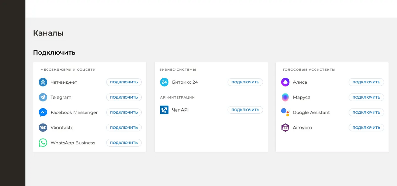
Information architecture and channel grouping. Users said finding the right channel was awkward. To cut cognitive load and speed up the search, I reworked the catalogue structure.
What I did. Three logical groups:
- Chats and social networks
- Voice assistants
- API & business systems
Visual design of the cards: iterations and composition. The brief was a clean, compact, scalable design. I worked through a run of fast iterations.
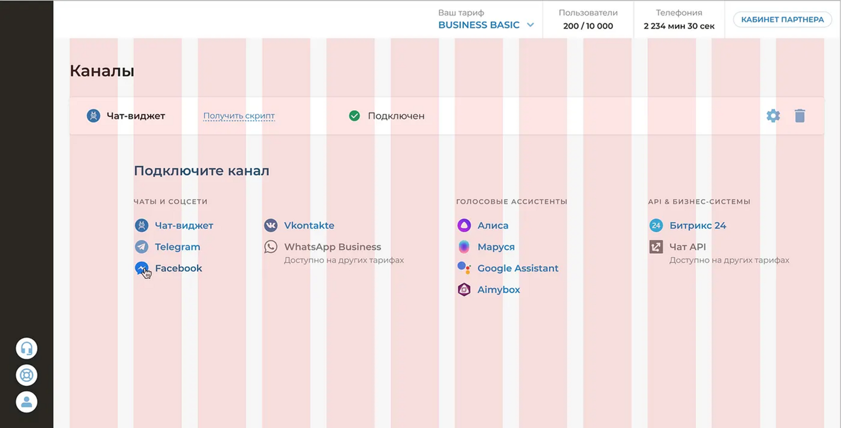
A few UX details surfaced along the way and needed work:
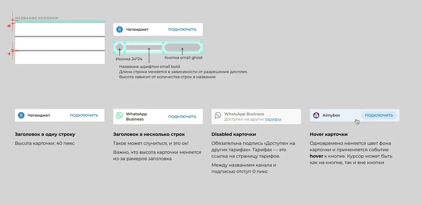
- Killing false affordances. In the first iterations bare channel names read as links that would navigate somewhere unwanted. I brought a background surface back behind every channel to remove that effect.
- Strengthening the CTA. To make the scenario obvious I put an explicit “Connect” button inside the cards.
- Built-in upsell. The caption carries a commercial scenario too: an “Available on other plans” note for integrations that aren’t paid for or are locked.
Hallway testing
I ran hallway tests, asking people to find VKontakte: in the new layout they found it 1–2 seconds faster. The common verdict was “now it’s clear where to look for what”.
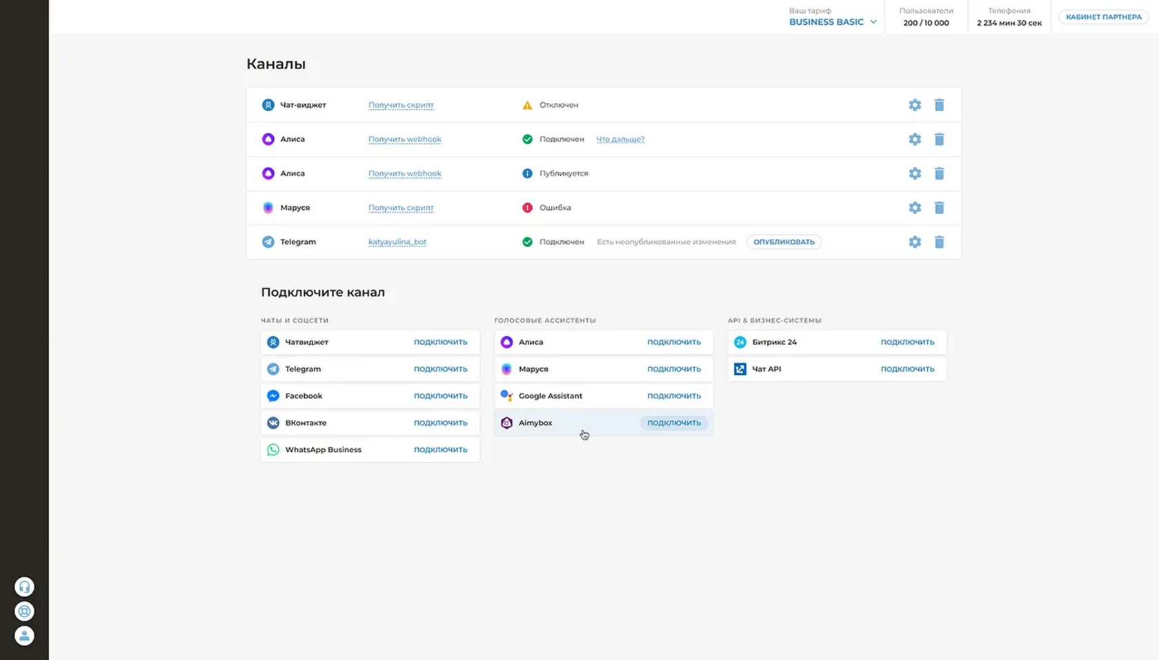
After the hallway test I worked through how the layout behaves at 1920×1080.
Working with development
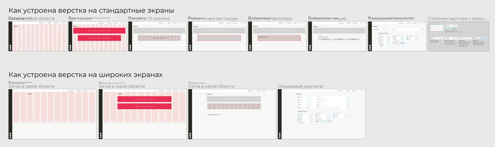
I wrote the developer guide: step by step, how the screen is built as a whole and section by section, with standard and wide formats covered separately.
The card has non-obvious states and behaviour: the channel name can run to one line or several, the channel can be locked for connection, the pointer can hover over the card. So the channel card is documented in detail.
That guide was later used for the design-to-build review, which I ran myself.
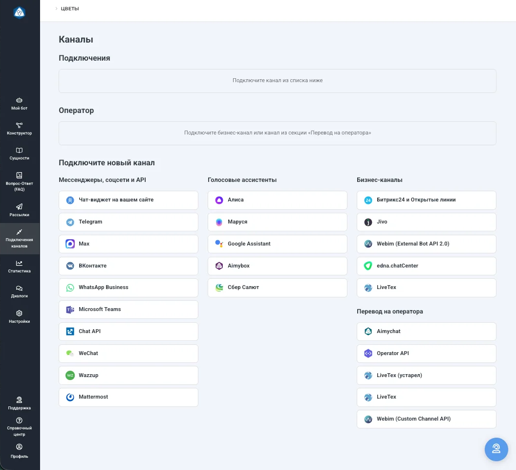
Two weeks later I learned the product would let you add human operators alongside the bot, gain more integrations, and change its pricing. The “Available on other plans” card state became obsolete, and I removed the “Connect” button — the action was clear without it. Two sections appeared at the top of the interface: “Connections” and “Operator”.
Before — After
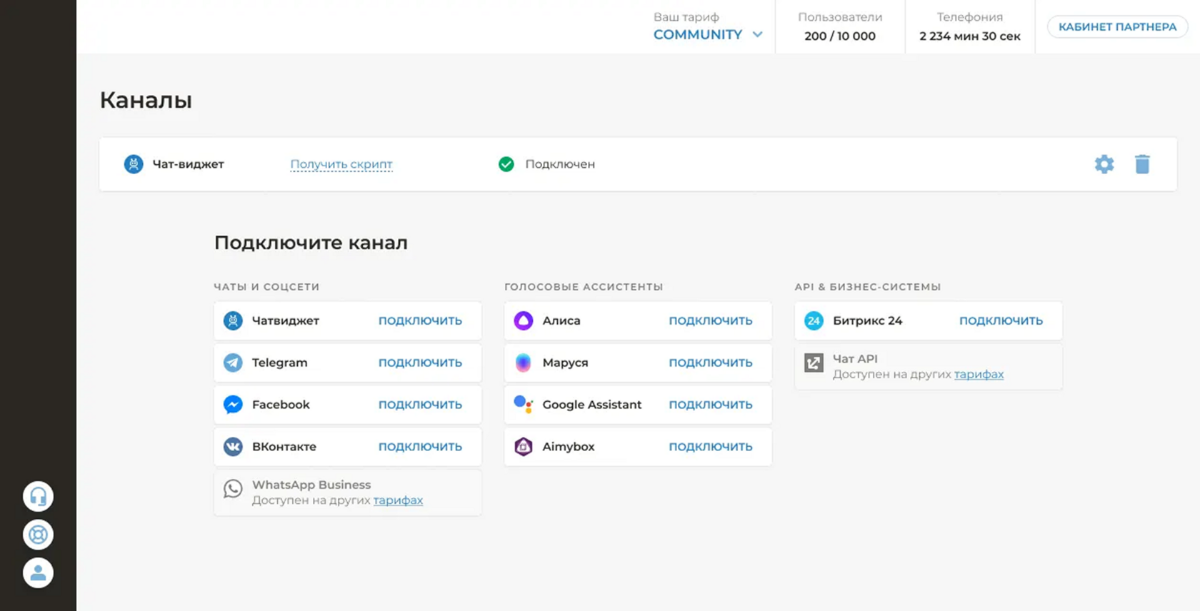
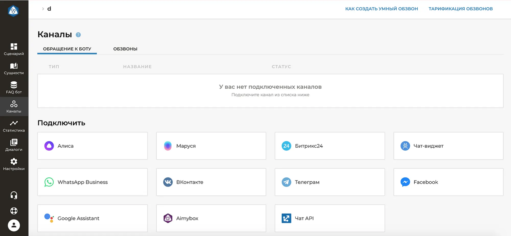
Regrouping the catalogue ended the complaints about search, and the new interface scales to future integrations without a redesign
Six years on, the screen is conceptually unchanged.