
Onboarding in a 20-year-old product
BILLmanager is a billing platform by ISPsystem, a vendor of hosting-automation software. Hosting providers and resellers of software, VPS and SSL use it to manage customers and transactions and to configure plans, service catalogues, payment acquiring and promotions
ISPsystem’s customers come in two recognisable profiles. One owns an infrastructure business across several countries, serves both companies and private customers, and wants a single product instead of a chain of billing, payment processing and support tools. The other co-owns a small hosting company, has a technical background, is tired of keeping records in several disconnected programs, and is sensitive to the price of the plan.
The customer journey in BILLmanager
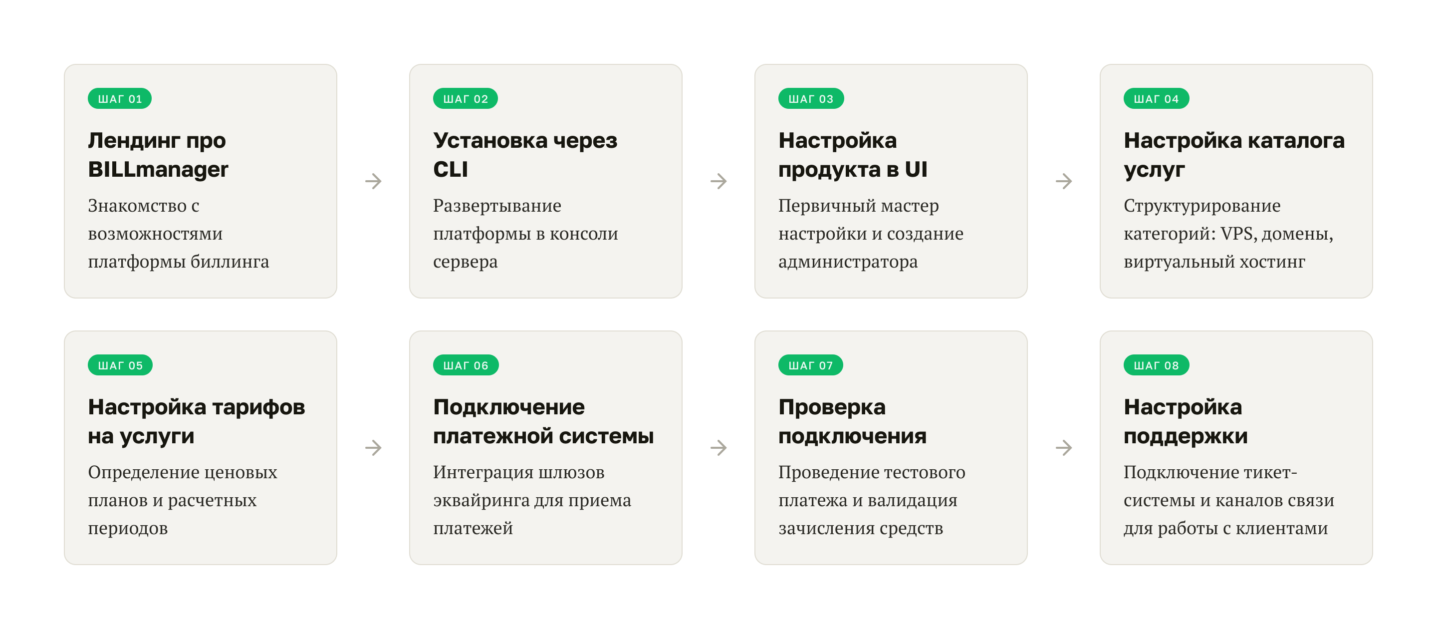
Self-service install and setup mattered a great deal to ISPsystem: the standard scenario had to get simpler, to take load off support and bring its cost down.
Usability research and findings
The UX team was three people: me (Lead UX/UI) and two mid-level UX/UI designers. I planned the study — mapped the CJM stages, wrote the interview questions and briefed my colleagues on collecting and processing the data. I assembled the final reports and presented the results.
Twelve participants took part. Four went through the scenarios on their own and sent in diaries; eight worked with a moderator. Unmoderated runs took 4–6 hours and stretched across several days; moderated ones took 1–1.5 hours.
We logged problems at every touchpoint — from the website and the documentation to the interface and the command line. The full report holds 163 findings grouped into five areas: marketing, documentation, technical, business, interface design. Each area’s report went to the team that owned it, to work through and fix.
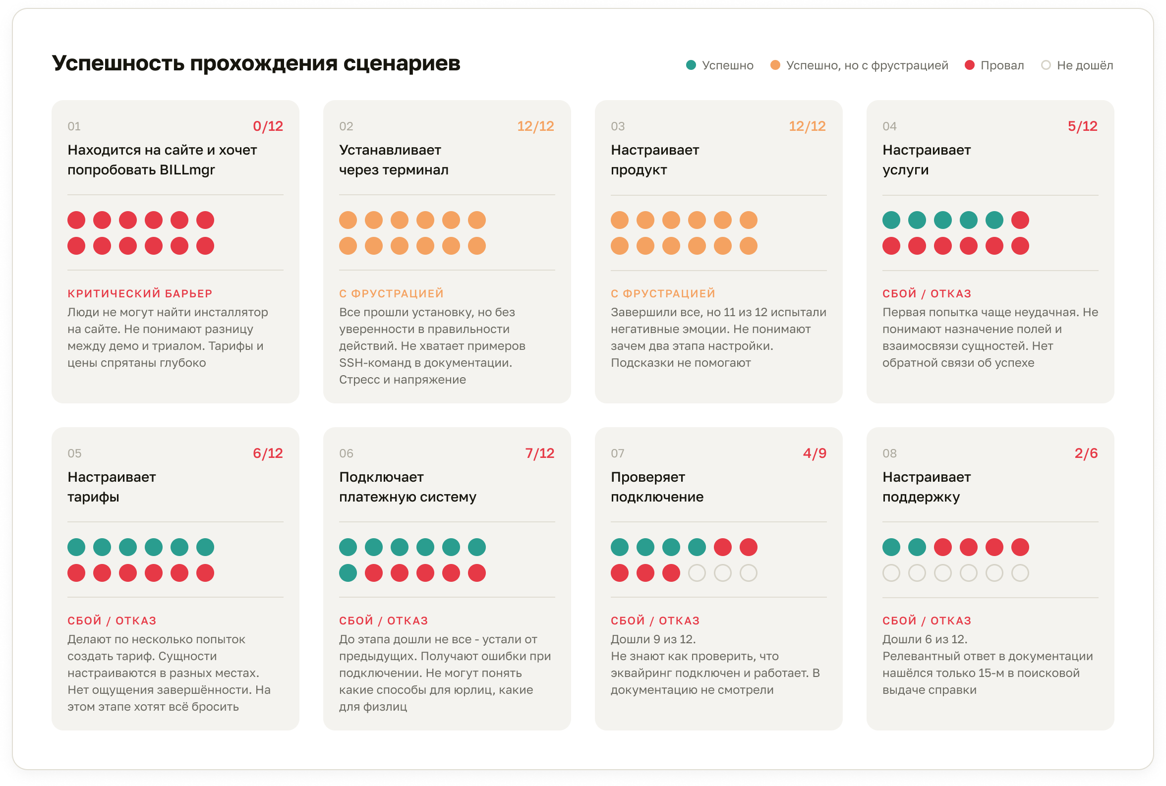
What the research changed
I prioritised the problem areas on a single principle — the closer to the top of the funnel, the higher the priority — and got a green light. The 2023 roadmap picked up configuring the product in the UI, and configuring the service catalogue and plans. Marketing took the landing-page problems, the software architect took the CLI, the technical writers took the documentation — and the product team started with scenario 3, Setup.

If the interface explains itself, the customer will finish setup without leaving for the documentation or writing to support
Floor: qualitative confirmation in a repeat test with the same participants that it had become simpler and better. Ceiling: fewer support requests in the product-setup scenario.
Product team
Me — Lead UX/UI: I drove the wizard concept, owned the design system and supplied its components to the solution. A mid-level UX/UI designer assembled the mockups and ran the repeat test. Frontend and QA built and tested it.
Working out the solution
BILLmanager was already 20 years old, which meant no new fields could be added and no old ones removed. Hiding them, moving them to another section and rewording them was allowed.
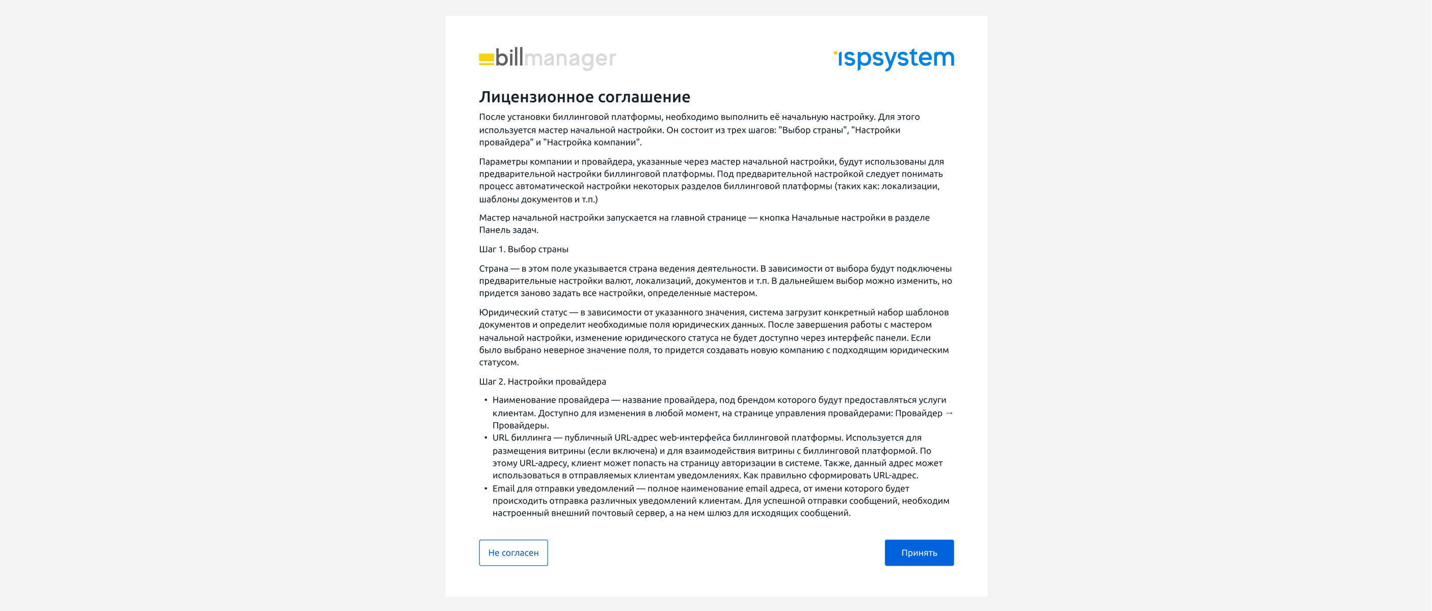
We re-laid out the licence agreement.

A wizard concept already existed in the UI. We kept it and reworked only what the steps contained. The settings had sat across four screens in two sections; we reshaped them into three sequential steps. Every required field went to step 1, which we named “Required settings”.
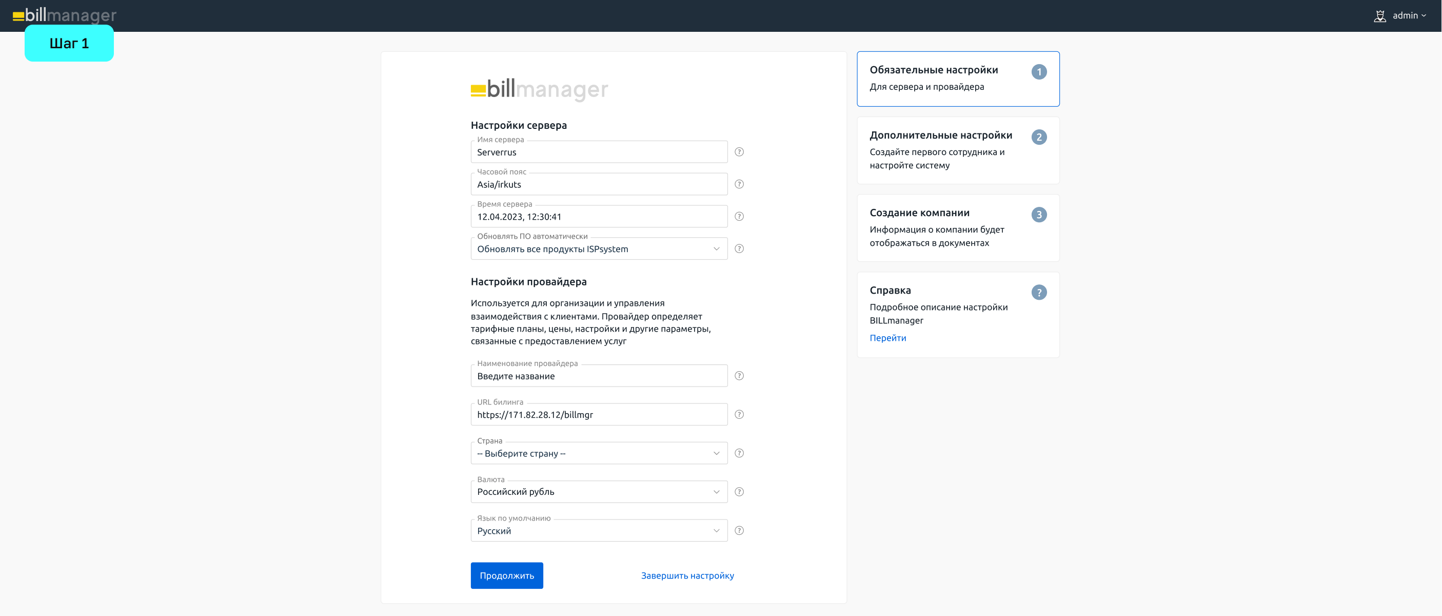
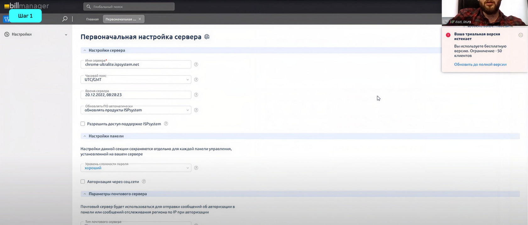
Fields the customer does not need for a first setup, but which the system needs to run correctly, go under the hood. Password strength rules for users, log retention settings, granting ISPsystem support access — exactly that kind of field. They all have defaults, and the system already ships configured correctly.
Step 2 took the admin settings: important in general, but not required to reach the workspace. Why? Because in BILLmanager’s own terminology the admin is the first employee, while the person going through the wizard is user zero, the super admin.
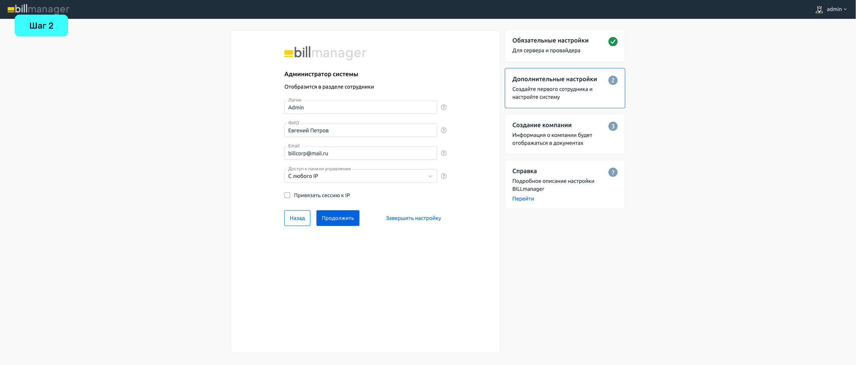

One more group: fields a user can fill in later, once they have the information. Leaving them empty never stopped setup as a whole, but it did put a barrier in front of the workspace. Support email, the purpose of an advance payment, the company website URL, the fax number, the postcode of the company address — all of these moved out of initial setup.
Step 3 holds the fields for creating a company.
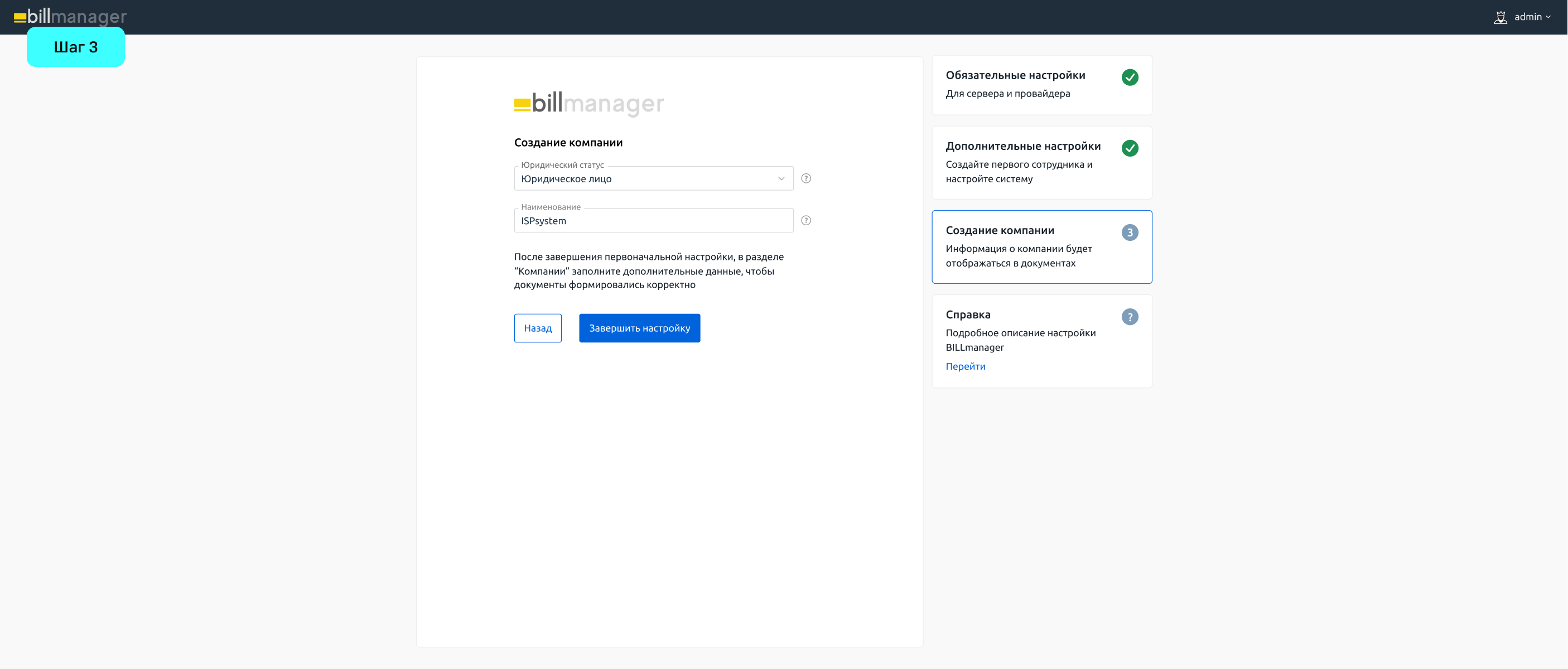
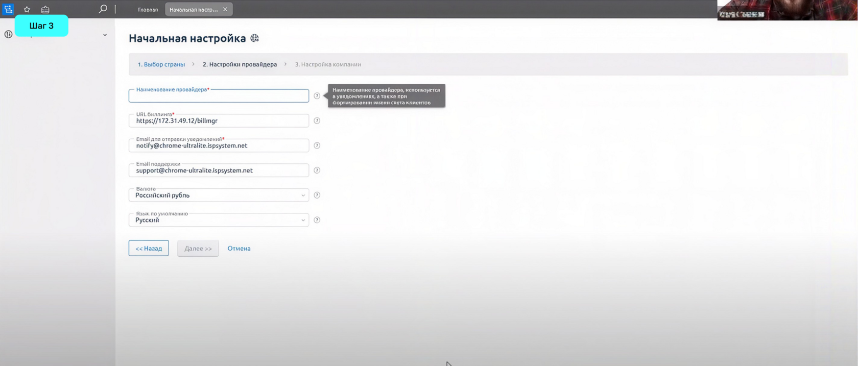
At the end we added a dialog explaining where these settings can be changed later.
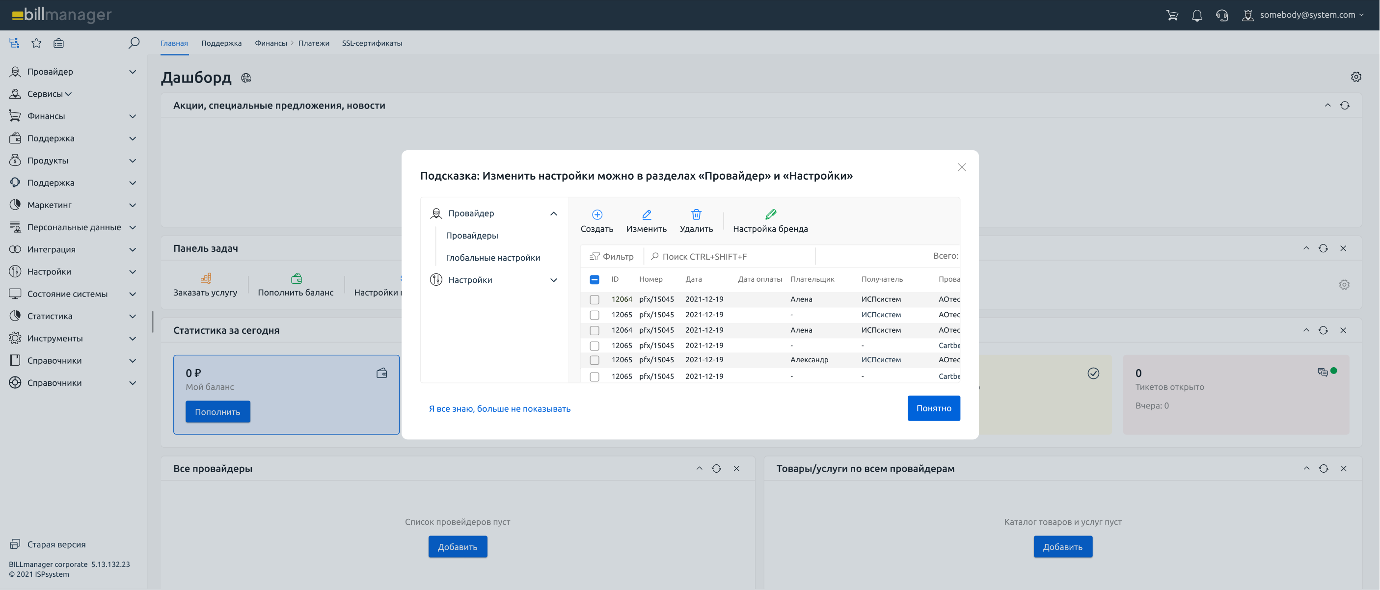
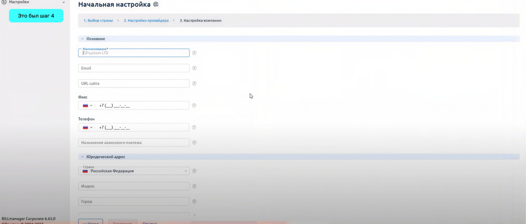
The UI was worked out in parallel with the UX. At that time a refreshed design system was being rolled into the company’s interfaces. I supplied components from the design-system team and had to adapt and finish them on the fly. We synced with frontend regularly so that development held no surprises.
We went back to the same participants and asked them to compare it with what had been there before.
“much better”
— the unanimous reaction of participants in the final test
The interface became noticeably clearer. Steps, fields and labels now read intuitively
Not a single participant turned to the documentation