
New onboarding: +1.3% Retention
MyOffice Documents is a mobile app for working with documents on phones and tablets, made by MyOffice, a Russian office-software vendor. Rated 4.6 on Google Play as of February 2025
Problem. People opened the app and created no documents at all — or created exactly one. 80% never came back, and of those who stayed, fewer still reached a subscription. Yet the ones who did stay praised the app for being convenient, for its features, for how it handles PDFs, cloud storage and a range of document formats. The value was in the product; users were not finding it.
We used the AARRR funnel to work out why the drop-off happens on day one specifically. Our read was that the value of the app sat too deep for new users — and we turned that into a hypothesis.
New onboarding that shows the value of the app before the first action will raise engagement and retention
- Floor — do not make retention worse
- Ceiling — improve retention
Team
On the project: me — Lead UX/UI, running the research, the flow, the concepts and the brief for the A/B test; Ekaterina Matlakhova, senior designer — illustrations, visual style and implementation review; a product manager — prioritising the work and making the case at C-level; a product analyst — designing the experiment and analysing the A/B results; Android developers and QA.
Audience
The audience splits into B2C and B2B. B2B are corporate employees whose company has already bought MyOffice Documents. B2C comes in two scenarios: someone has bought a new phone with the app preinstalled, or they already have a phone and are choosing a file app themselves.
I went through the data: a third of active users work only with PDF files. Documents are mostly viewed rather than edited — and PDFs are edited more often than anything else. The data suggested that for the 80% who left, the breadth of format support and the presence of a PDF editor may simply never have been obvious.
We read Google Play reviews regularly and knew that forums and Telegram chats kept asking “how is MyOffice Documents better than Microsoft 365” (the answer: the formats it supports and the cloud storage it connects to). That knowledge let us write the user stories.
| Segment | What they want, and why | Can onboarding solve it? |
|---|---|---|
| New phone | Wants to grasp the app’s use and its size straight away, to decide whether to keep it or delete it — memory is tight on a budget device | Yes, except the size |
| Already has a phone | Looking for an app for files and notes — wants to size up the capabilities quickly and feel a modern product | Yes |
| Already has a phone | Someone recommended MyOffice Documents — wants a quick read on the feature set | Yes |
| Already has a phone | Wants to understand the difference from Microsoft (cloud storage, PDF editor) to make a final choice | Yes |
| Corporate employee | The company bought the software — wants to connect to corporate cloud storage | Yes |
| Across segments | Wants the process to be interesting and to keep their mood up | Yes, through illustrations |
| Across segments | Sceptical about Russian-made software — wants the product to change their mind | No |
Analysing the solution
With senior designer Ekaterina Matlakhova I looked at how tool apps solve the problem of conveying value: Vectornator, Goodnotes, Curve and Animation Desk. We already knew the onboarding of our direct competitors — it held no insight for us. In every app we studied, the first screen answers “why would I want this app” before the user has done anything at all. Ours did not answer that question.
All four built their first screen on a video demo of the features. We ruled that path out: video would bloat the build, and part of our audience are people on budget phones already deciding whether to keep the app or delete it for want of memory.
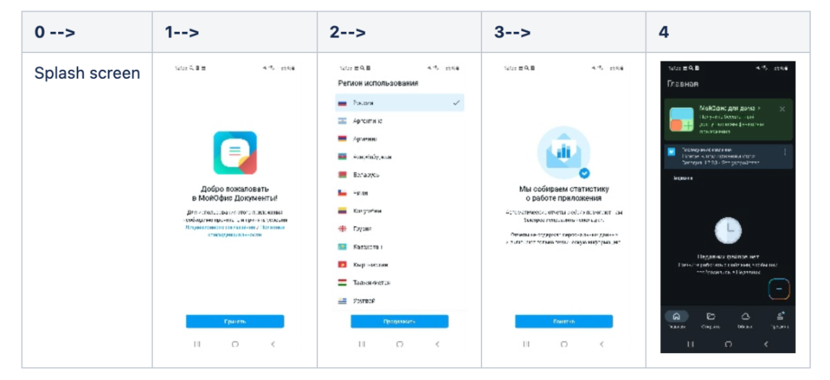
When I judged the existing onboarding by one simple test — who benefits from it — it was clear: the value went to the developer, not the user. We were collecting permissions and setting up location, and never explaining what the person would get. That was the cause.
The alternative to onboarding
I considered stories on the home screen instead of onboarding screens — controllable content, minimal space, and you can come back and watch again. But stories would have meant building the infrastructure from scratch: a display component, publishing and viewing logic — laborious and slow just to test one hypothesis. Onboarding already existed as a mechanism, so all that was left was changing the content and launching an A/B test.
Design: from wireframes to mockups
Then I started designing: the new flow and wireframes first. I needed to work out how many screens were needed, what to say on them and in what order.
The wireframes had four screens: document formats, PDF, a trust screen — with the app rating and a line about a reliable Russian developer — and cloud storage. I dropped the trust screen at that same stage: people do not read text in onboarding, and offsetting the negativity in Google Play reviews with a single screen is a weak bet. Three screens went to the final, each about a concrete benefit rather than about reputation.

In parallel I ran a user survey: we wanted to know what life situations make people open the app. The survey was there to feed the illustrations — so that a user would recognise themselves on an onboarding screen: not an abstract character but a real scenario — a business trip, working on the move, documents on the road.
Illustrations and final design
Working from the survey, Ekaterina Matlakhova developed the illustrations and the visual style — each one reflecting a concrete scenario from a user’s life.

The style was approved and we finished the production mockups. We did not work on the cloud-connection scenario: it already existed in the app and worked.

We adapted the mockups for tablet.

Adapting for tablet turned up a constraint: the illustrations cannot run the full width of the screen without a new component. Rather than build one from scratch, the developers suggested an existing component from the design system — which kept both the schedule and the consistency of the interface.
Before — After


Frontend review
Ekaterina Matlakhova reviewed the finished build alongside QA, in two passes: first she went through every state — phone and tablet, light and dark theme — and logged each deviation from the design as a bug or a question for the developer. After the fixes she checked again: deviations closed, nothing new introduced.
Results
The test ran for 16 days on a random 50/50 split: the control group got the old onboarding, the test group the new one. After the test the new flow was rolled out to 100% of users.
The new onboarding has a stronger effect on early retention
The absolute gain stays close across every horizon: +1.3–1.5 pp. But relative to the control group the effect peaks on the first day — +9.4% against +2.6% by the first month
Takeaway: the new onboarding gives the strongest early signal. As baseline retention grows, a similar gain in percentage points makes up a smaller share of the control value.
The new onboarding raised engagement and left trial conversion unchanged